Here is the uncomfortable truth about most high school t-shirt designs: students wear them once because they have to, then never again. The gap between what committees approve and what teenagers actually like is real, but it is not hard to close. If you want a shirt that shows up in weekend outfits and graduation photos alike, design for the wearer, not the noticeboard.
What Students Actually Want

Start with the cut. The single biggest upgrade is offering an oversized, boxy fit instead of a slim unisex tee; it matches how students already dress. Next, colour: black, white, cream, and washed neutrals get worn, while bright novelty colours mostly do not. Finally, design restraint. A small front chest print with a bigger statement on the back reads as streetwear; a giant crest across the chest reads as a uniform.
Design Ideas That Work
- Varsity typography: the school initials or class year in classic collegiate lettering, front and centre or as a small chest hit.
- Back-print graphics: a large illustration, mascot redraw, or year graphic across the upper back, with a clean front.
- Sports-jersey style: surnames and numbers on the back, ideal for class shirts and house events.
- Vintage wash aesthetics: distressed prints on washed-tone tees for an instantly fashionable, retro feel.
- Minimal line art: a single-line drawing of the school building or mascot for a subtle, wearable graduation tee.
Get Student Input Early
The fastest way to guarantee a shirt nobody wears is to design it without the people wearing it. Run a short poll on two or three design directions, or better, invite design submissions and let the cohort vote. Participation creates ownership, and ownership is what turns a school shirt into something students choose to wear. Keep the vote to a small number of strong options; unlimited choices produce design-by-committee mush.
Fabric and Print Choices That Feel Premium
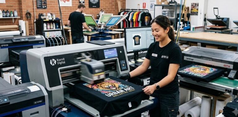
Design direction gets a shirt approved; fabric gets it worn. A heavyweight 220 to 250 gsm cotton tee in a boxy cut immediately feels like retail streetwear rather than event merch, and the price difference per piece is smaller than most committees assume. For print, a clean silkscreen finish suits bold typography, while DTF handles gradients and detailed illustrations. Puff prints and embroidery are worth considering for small chest hits, adding texture that students associate with brands they already buy. If the budget forces a choice, spend on the blank first and simplify the print; a simple design on a great shirt beats a complex design on a flimsy one.
Colour of the blank matters too. Washed black, off-white, and faded earth tones photograph well and match most wardrobes, which is exactly what drives students to keep wearing a shirt after the event that spawned it.
From Idea to Printed Shirt
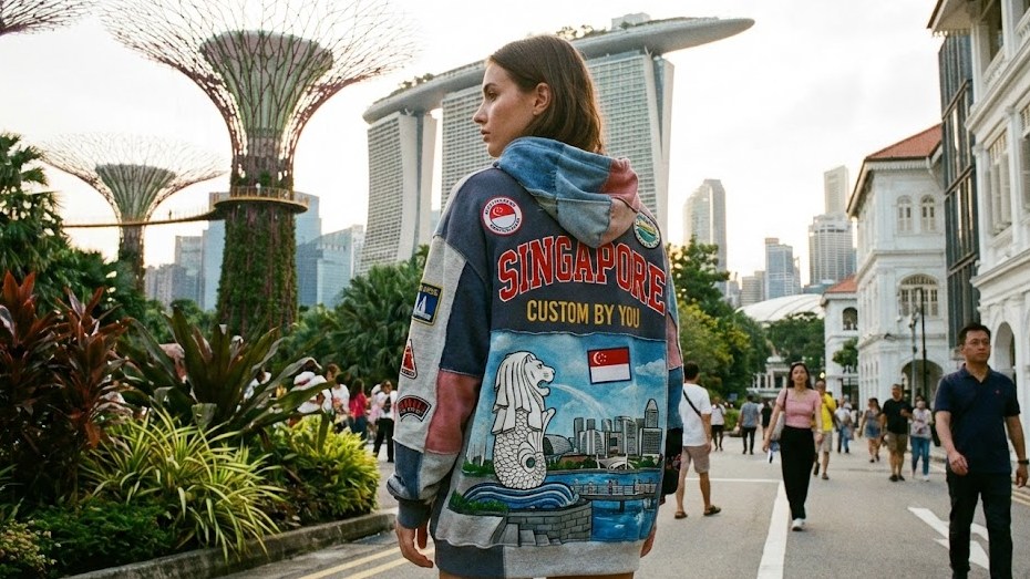
Once the design direction is set, fabric and print quality decide whether the shirt feels premium or disposable. Browse the Shirtual lookbook to see fits, fabrics, and print styles that Singapore schools and classes have used, from classic cotton tees to heavyweight oversized cuts. Send us your design and we will help you turn it into a shirt that survives long past graduation day.